
Eric Ries describes the three A’s of metrics as Actionable, Accessible, and Auditable. Today, I’d like to share our take on what it means for metrics to be accessible.
What Are Accessible Metrics?
1. Everybody can see what’s going on
The first part is making the metrics dashboard available to everyone (including advisors/investors).
A business should be run as an aquarium where everybody can see what’s going on.
-Jack Stack, The Great Game of Business
2. Can be understood by the entire team
This brings up the second challenge: Ensuring that everyone also understands these metrics — not just the technical or marketing folks. For me, the litmus test for that is validating that anyone on the team can quickly look at the metrics dashboard and answer this basic question: “Are we making progress?”.
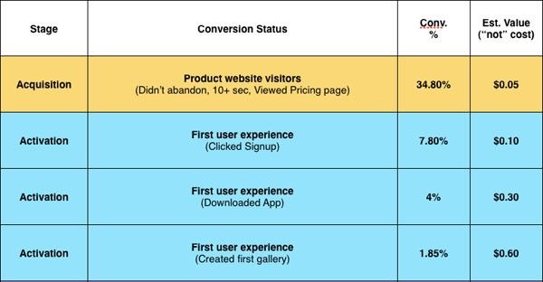
This was the challenge I imposed on my team when designing the dashboard for our upcoming USERcycle product, which heavily uses Dave McClure’s Pirate metrics model.
Let's see how we did.
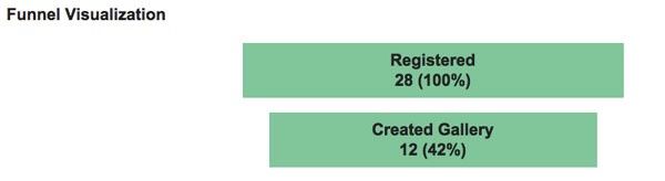
The Funnel Chart
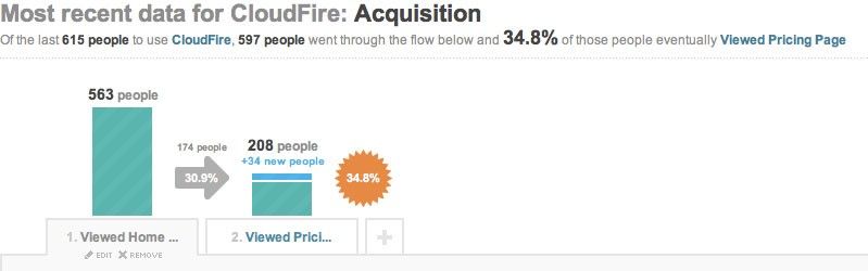
The obvious starting point was using a funnel chart like the one shown below:
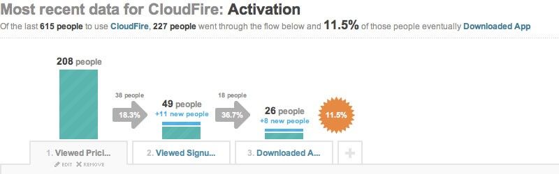
The pros of the funnel chart are that it is simple and visual. Where it fails is when you put two funnels next together.
Quick: In the figure below, did we make progress in June?
You probably had to carefully study the numbers to make that determination because the visualization itself didn’t answer that question. This was not good enough.
One option was to play with the proportional sizing of the funnel.
We could make the funnel proportionally wider:
or proportionally taller:
But that actually makes matters worse!
How about traffic light indicators?
Now we are getting somewhere. But the “funnel” metaphor isn’t really adding anything, so why keep it?
Bar Charts Are Even Simpler And Better
In the version below, we replaced the funnel chart with a much simpler bar chart (and got rid of some spurious information) which makes it easier to compare relative sizes. However, because metrics improvements are typically small, you still need the traffic light indicators.
Could we do better? While this version cleaned up the visualization, it still assumes the reader knows whether a 50% retention rate is good or bad. What if they don’t?
Meet the Bullet Graph
We then ran into the bullet graph developed by Stephen Few, which extends the basic bar chart with two powerful embellishments.
The first is its use of (color-blind friendly) background fill colors that can be used to encode ranges for bad, satisfactory, and good:
Now anyone could use the dashboard not only to answer if the metrics improved but also whether the current metrics are any good.
The second thing the bullet graph does is use a symbol marker that can be used to encode a comparative measure:
The way we decided to use the symbol marker was to encode the previous month’s values which allowed us to eliminate the chart for May as well as get rid of the traffic light indicators.
I’ll admit it might take a little acclimatization, but once you’re there, you can very quickly tell if the current month’s metrics performed better than last month’s metrics. Plus, it gets rid of a whole lot of ink (pixels), improving the data-to-ink ratio, which makes the data visualization geeks happy:
Above all else show the data.
- Edward Tufte
What do you think? Can this be improved even more?